


Project Background & Personal Journey
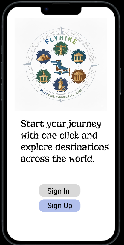
FlyHike is a travel-based digital platform designed to simplify trip planning by bringing destination discovery, comparison, and planning into one seamless experience. The idea was to solve common user problems like scattered information, difficulty in comparing options, and lack of personalized guidance across existing travel platforms. The goal was to create a clean, intuitive, and engaging interface that helps users plan their journeys efficiently in one place.
This project marked a key step in my transition into UI/UX design, where I applied my technical background to solving real user problems. I conducted user research to understand traveler pain points, built user personas and journey flows, and designed wireframes and high-fidelity prototypes using Figma. Throughout the process, I focused on improving usability, clarity, and creating a structured visual hierarchy.
One of the main learnings from this project was balancing aesthetics with functionality. Initially, I leaned more toward visual design, but through iterations, I learned to prioritize user needs and usability. FlyHike helped me strengthen my design thinking process, gain confidence in end-to-end product design, and truly shift my mindset toward becoming a user-centered UI/UX designer.
Research
The research phase focused on understanding the real challenges faced by international students and frequent travelers when planning trips in a new country. I began with secondary research to study existing travel platforms and identify common usability issues such as fragmented services, unclear pricing, and complex booking flows.
This was followed by primary research through user surveys and informal interviews to gather firsthand insights into user behavior, needs, and pain points. The findings revealed that users often rely on multiple apps for buses, flights, trains, and hotels, which leads to confusion, time loss, and inconsistent experiences. Many participants expressed a strong need for a centralized platform that offers clear information, easy comparison, and simple navigation.
These insights were further organized using affinity mapping to identify recurring themes and priorities. The research outcomes directly shaped the product direction, feature selection, information architecture, and design decisions, ensuring FlyHike was built as a user-centered and practical travel solution.
User Surveys & Interviews
To understand how users plan their trips and interact with existing travel platforms, I conducted a mix of surveys and one-on-one interviews with frequent travelers, students, and working professionals.
Survey Overview
Key Survey Findings
use multiple apps for a single trip
find travel planning time-consuming
struggle with comparing options clearly
prefer a simpler and more guided experience
value transparent pricing over discounts
User Interviews
I conducted 5 in-depth interviews to understand deeper motivations and real user experiences during travel planning.
Interview Insights
- Users feel overwhelmed during the planning phase
- Many rely on manual comparison across apps
- Users prefer visual exploration before making decisions
- Confusion arises due to unclear pricing and too many steps
- A clean and structured interface builds trust and confidence
Key Takeaways
Card Sorts & Affinity Mapping
To better understand user expectations and mental models, I conducted card sorting and affinity mapping exercises. These activities helped identify common patterns in how users grouped features related to travel booking and navigation. By organizing insights into clear themes, I was able to simplify information architecture and prioritize essential features.
The findings ensured intuitive navigation, logical categorization, and a seamless user flow, reducing confusion and aligning the app structure with real user behavior and needs.
🔴 Pain Points
- App switching
- Information overload
- Poor comparison
- Price confusion
- Hidden charges
- Cluttered UI
- Time consuming
- Untrusted reviews
- Weak filters
- Inconsistent experience
- Cost uncertainty
- Booking management issues
- Change difficulty
- No guidance
- Decision fatigue
🟡 Behavioral Points
- App hopping
- Option comparing
- Review checking
- Screenshot saving
- Long research
- Repeated visits
- Mobile preference
- Budget filtering
- Deal hunting
- UI preference
- Booking abandonment
- External planning
- Group sharing
- Visual browsing
- Session planning
🟢 Desire Points
- All-in-one platform
- Easy comparison
- Price transparency
- Personalized suggestions
- Clean interface
- Fast booking
- Trip management
- Smart recommendations
- Real-time updates
- Trusted reviews
- Flexible booking
- Time saving
- Budget friendly
- Visual exploration
- Stress free
Meet the Users: Personas, Task Flows, Journeys
In preparation for wireframing, I explored the spaces where travelers actively search, plan, and share their experiences—such as travel forums, social media groups, and booking platforms. This helped me understand how users interact with existing solutions and where they face friction during their journey.
By engaging with real user behaviors and patterns, I was able to build a strong understanding of their expectations, frustrations, and decision-making processes. This empathetic approach allowed me to uncover not just what users do, but why they do it, which played a key role in shaping the overall design direction.
These insights helped me craft meaningful personas that represent different types of travelers, along with their goals and challenges. Based on these personas, I developed task flows and user journeys to ensure a smooth and intuitive experience across the platform.
In this way, I gained valuable insights that helped me create, or rather uncover, my personas for FlyHike.
The insights I gathered during my research helped me develop 3 personas:
Rahul
The Budget Explorer
Sneha
The Experience Seeker
Daniel
The Efficient Planner
Rahul – The Budget Explorer
🎯 Goals
- Find affordable travel options
- Compare prices quickly
- Plan trips within a tight budget
😣 Frustrations
- Hidden charges
- Too many apps to compare
- Confusing booking flows
🧠 Behaviors
- Filters by price first
- Searches for discounts
- Compares multiple platforms
❤️ Needs
- Transparent pricing
- Easy comparison tools
- Budget-friendly suggestions
Sneha – The Experience Seeker
🎯 Goals
- Discover unique destinations
- Plan memorable experiences
- Explore visually before booking
😣 Frustrations
- Generic recommendations
- Lack of personalization
- Too much irrelevant content
🧠 Behaviors
- Scrolls through images/videos
- Saves travel ideas
- Relies on reviews
❤️ Needs
- Personalized suggestions
- Visual exploration
- Curated experiences
Daniel – The Efficient Planner
🎯 Goals
- Plan trips quickly
- Manage everything in one place
- Avoid unnecessary steps
😣 Frustrations
- Time-consuming planning
- Disconnected tools
- Repetitive data entry
🧠 Behaviors
- Prefers structured flows
- Uses apps for organization
- Books quickly once decided
❤️ Needs
- All-in-one platform
- Clean interface
- Fast booking process
Exploration & Ideation
During the exploration and ideation phase, I followed a structured UX process to transform research insights into meaningful design solutions. I organized ideas, references, and feature concepts using a tab-based approach, which helped me explore multiple design directions in parallel.
This method allowed me to compare user flows, evaluate usability trade-offs, and refine concepts iteratively. By continuously reviewing and narrowing down options, I ensured that design decisions were aligned with user needs, business goals, and technical feasibility, leading to a more focused and user-centered product experience.
Usability Testing
Test Persona – Alex, The Practical Traveler
🎯 Goals
- Quickly find best travel options
- Compare prices efficiently
- Complete booking without errors
😣 Frustrations
- Too many steps
- Unclear pricing
- Confusing navigation
🧠 Behaviors
- Scans rather than reads
- Prefers quick decisions
- Gets frustrated with delays
❤️ Needs
- Simple navigation
- Clear information
- Fast booking flow
Task Completion: Users were asked to complete core actions such as searching for travel options, comparing prices, and completing a booking to evaluate ease of use.
Navigation & Clarity: Tested how easily users could understand labels, move between screens, and find key information without guidance.
Feedback & Iteration: Collected user feedback on pain points, errors, and confusion, then refined layouts, flows, and interactions to improve overall usability.
Usability Testing Results & Affinity Mapping
Usability testing revealed key pain points related to navigation clarity, comparison of travel options, and booking flow efficiency. By grouping user feedback through affinity mapping, common patterns such as confusion caused by too many steps, unclear pricing details, and the need for faster decision-making emerged.
These insights helped prioritize design improvements, simplify user flows, and enhance content clarity. As a result, the final design better aligns with user expectations, reduces cognitive load, and offers a smoother, more intuitive travel booking experience.
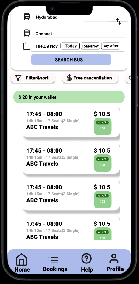
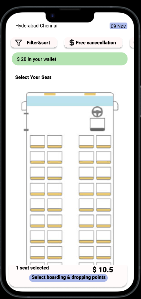
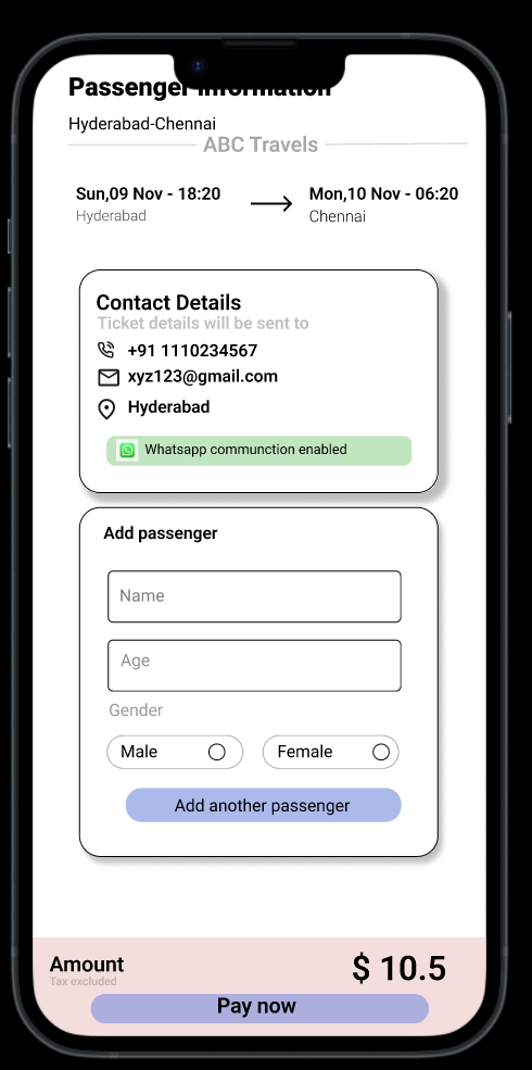
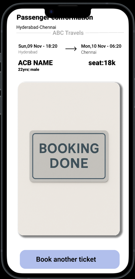
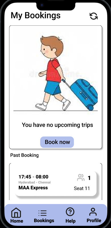
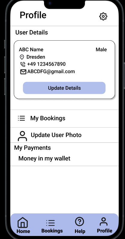
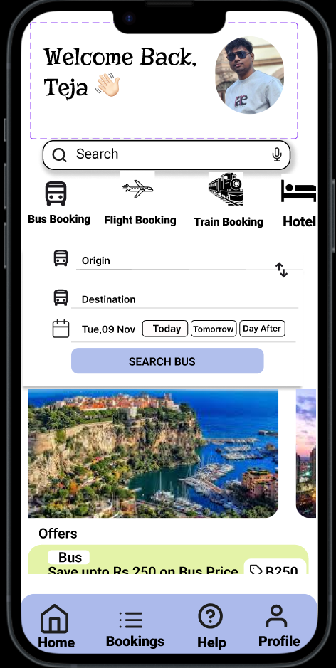
User Interface Design
The user interface of FlyHike was designed with a strong focus on real user needs, usability, and clarity. Based on research insights, I aimed to reduce confusion caused by complex booking platforms by keeping layouts clean and easy to understand.
A consistent design system was followed across all screens to maintain familiarity and reduce the learning curve.
Clear visual hierarchy was established using spacing, typography, and color to guide users toward primary actions such as searching, comparing options, and completing bookings.
Icons and labels were chosen carefully to feel familiar and intuitive, especially for international users. Accessibility was also considered through readable font sizes, sufficient contrast, and touch-friendly components. Overall, the UI design supports a smooth, confident, and stress-free travel experience.


FlyHike taught me
FlyHike taught me how to translate real-life problems into meaningful design solutions. It strengthened my ability to conduct user research, identify genuine pain points, and make design decisions based on user needs rather than assumptions.
The project also helped me improve my skills in structuring user flows, simplifying complex information, and iterating through feedback. Most importantly, FlyHike taught me the value of empathy in design—understanding users' struggles and creating experiences that feel supportive, clear, and human.